Fioravanti
A spirit of resilience.
Summary
To revive Fioravanti’s relevance, we embraced Ecuadorians’ spirit of resilience – known as ñeque – and repositioned the brand as a champion of the nation’s bold, vibrant people. Built on the essence of ‘Pride’, our ‘Flavourful People’ creative concept re-energised the brand with a dynamic new identity, featuring a refreshed wordmark by typographer Oli Frape and celebratory illustrated assets. The result? Fioravanti reversed its decline, achieving record volume growth in 2024 and surpassing its market share target in the Flavours category.
Problem
Fioravanti was battling to regain its relevance.
A change of formula and a lack of brand activity had led Fioravanti to lose some love from the younger generations. Between 2016 and 2021 the brand lost 7.6% of its market share, lost its category leadership position and had fallen to fifth place in the Ecuadorian soft drinks market.


Out of the struggle comes strength.
Consumer truth
Ecuador is overlooked, and Ecuadorians know it. Our consumer survey found Ecuadorians believed that their country is perceived to be small, insignificant and stuck in the past. But it’s the adversity that Ecuadorians experience, that has created their strength. When they look around, they see resilience, creativity, and a force so powerful that it has its own name – ñeque.


Brand truth
Fioravanti has empowered Ecuadorian expression since 1878.
Fioravanti has been proud to be at the centre of Ecuadorian tables since 1878. And in those 140 years, the brand’s bold flavour has been there for the country’s bold people. It’s witnessed countless moments when family and friends have put their passions into play, realised their resourcefulness and let their talents flow.
Fioravanti had flowed through generations but it was beginning to lose its fizz. We realised that the thing that made Ecuadorians most proud was each other. It felt only right that we brought their flavour to the fore. James Cook, Senior Strategist

Strategy
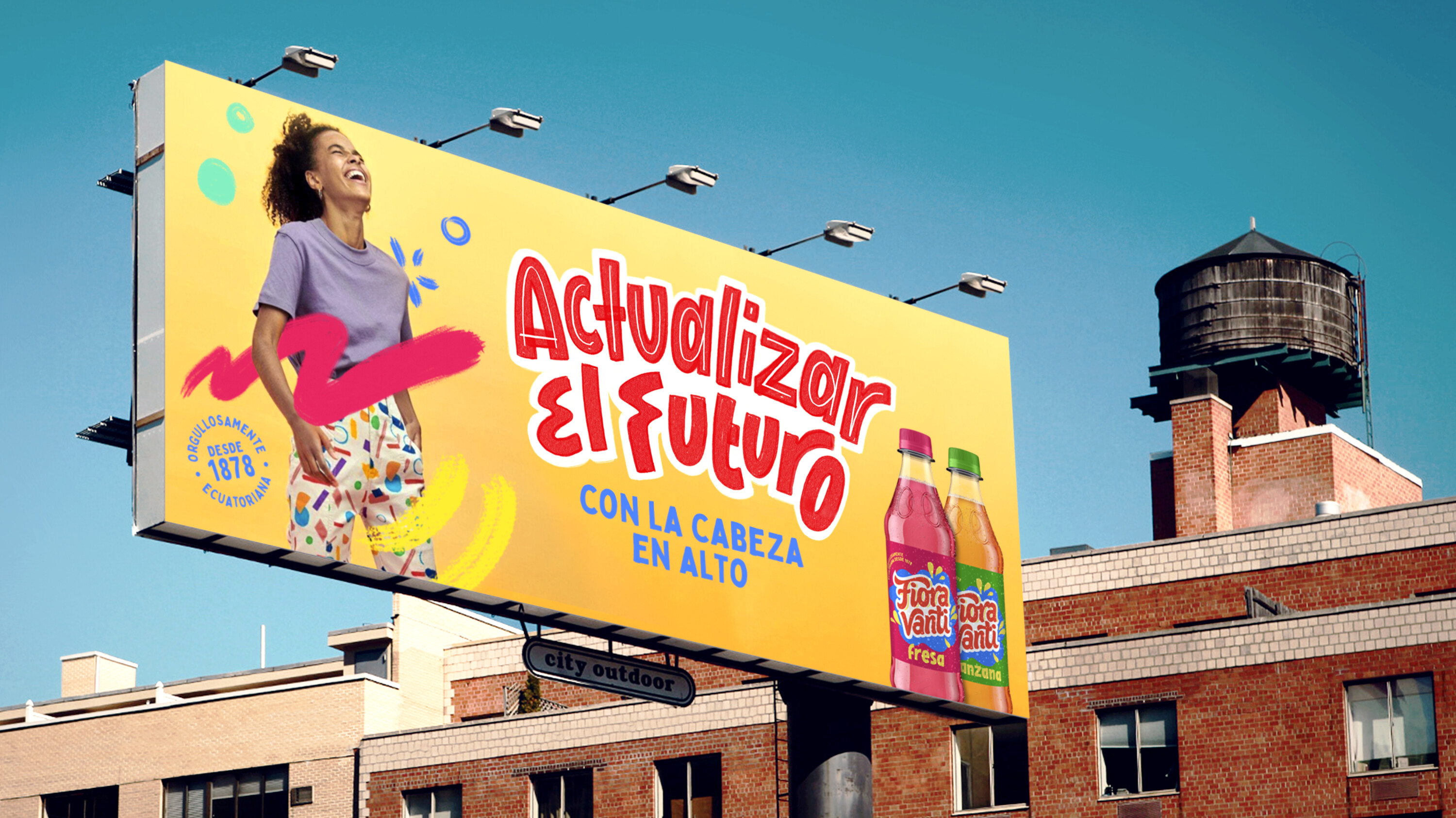
Heads held high, ñeque in their souls, Fioravanti on the table.
We defined Fioravanti’s brand essence as ‘Pride’. Pride in Ecuadorians, not Ecuador. In people, not place. In being iconic, not historic. From friends to family and food to fiestas, Fioravanti proudly fuels the flavour of a nation.
Concept
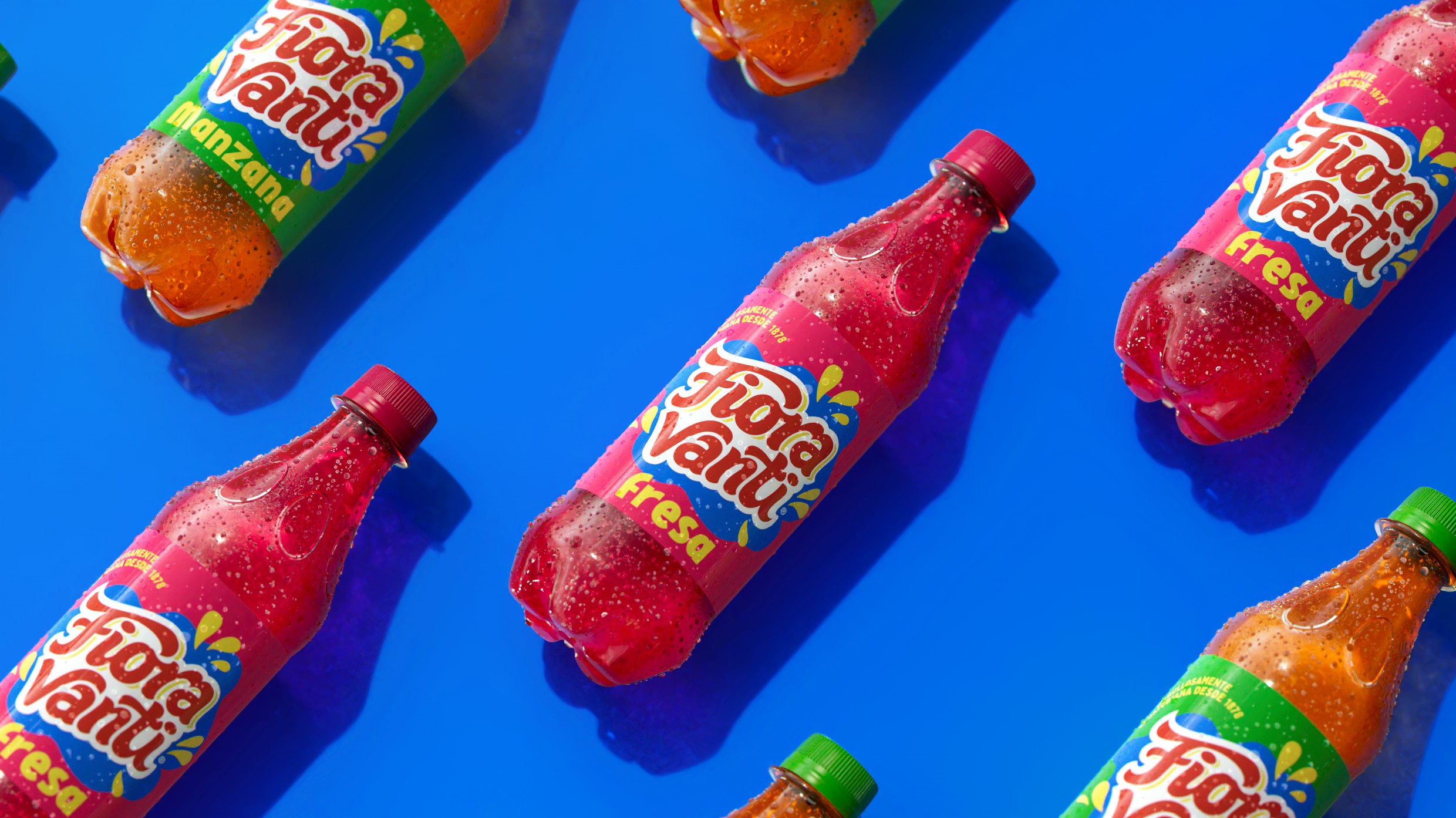
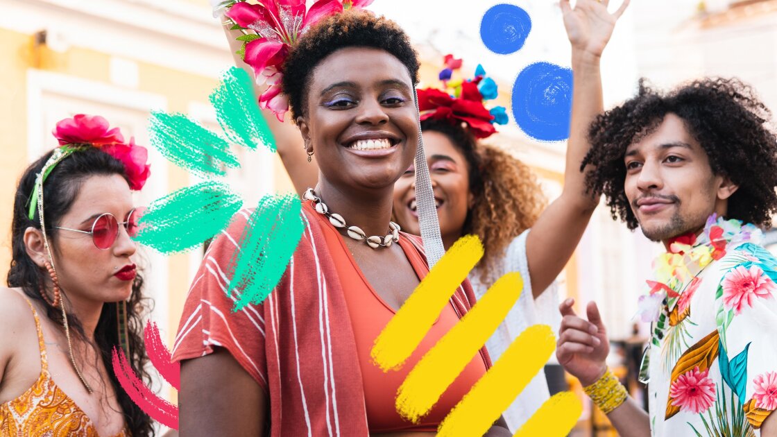
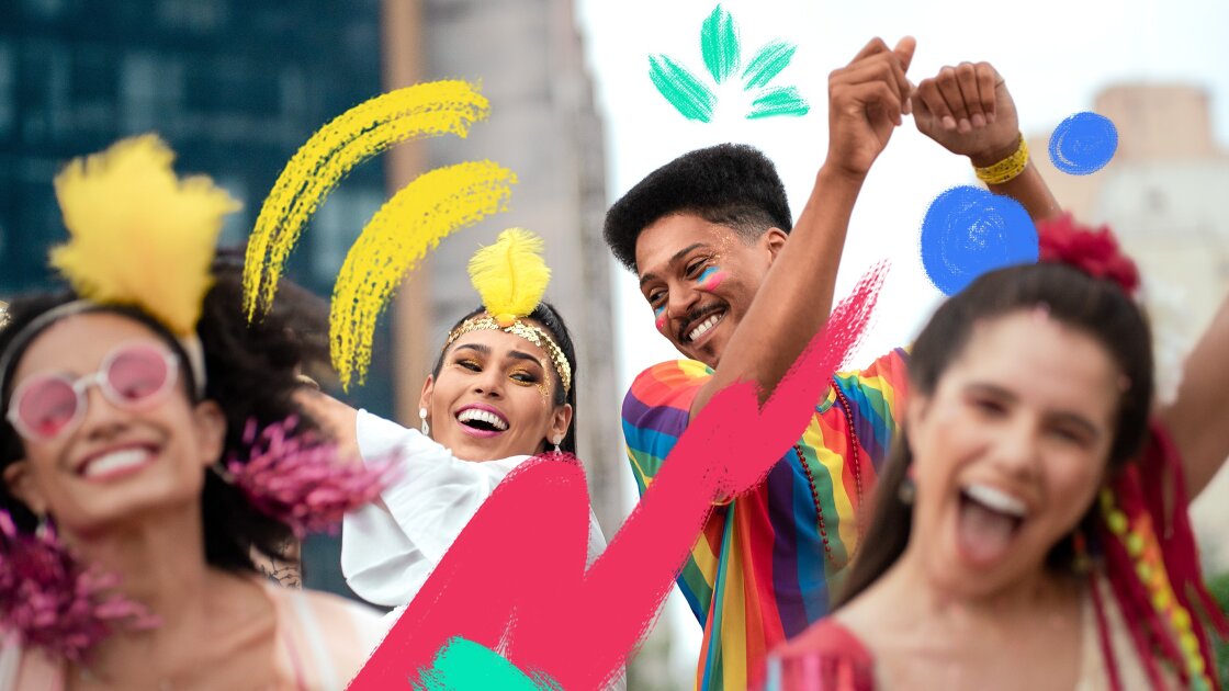
Flavourful people.
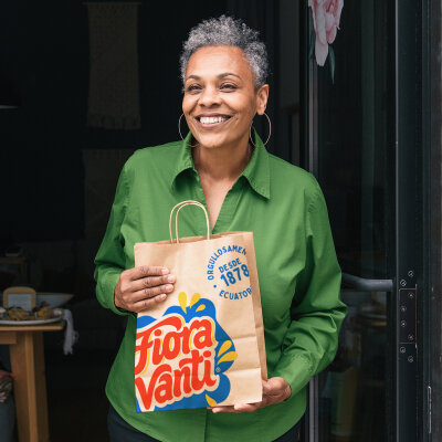
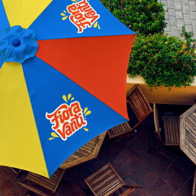
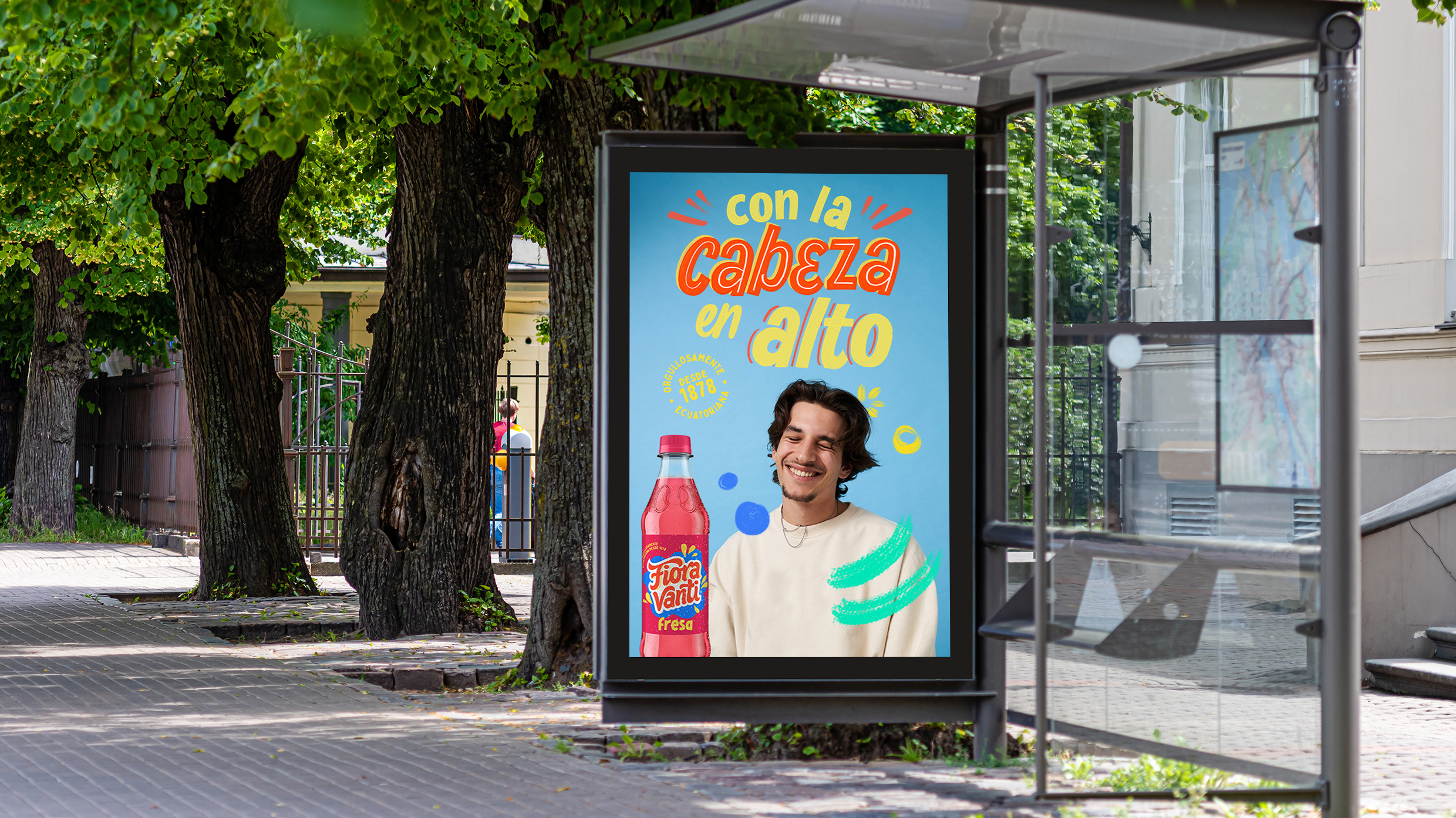
A full-on fiesta of the passion, colour and vibrancy of Ecuadorians – our ‘Flavourful People’ brand concept captured all the energy and excitement of the population… and bottled it. We brought this brand concept to life across the brand identity, packaging and brand world. And we even travelled to Ecuador to provide brand guardianship support during the filming of the TVC (above) which was developed by the brand’s Latin American creative agency.
Epoch refreshed a brand that’s woven into Ecuadorian culture with great sensitivity. Their thoughtful approach translated the brand’s heritage into a visual language that honours the past while engaging the present. Aline Perchez Tort, Design Director at The Coca-Cola Company

Craft
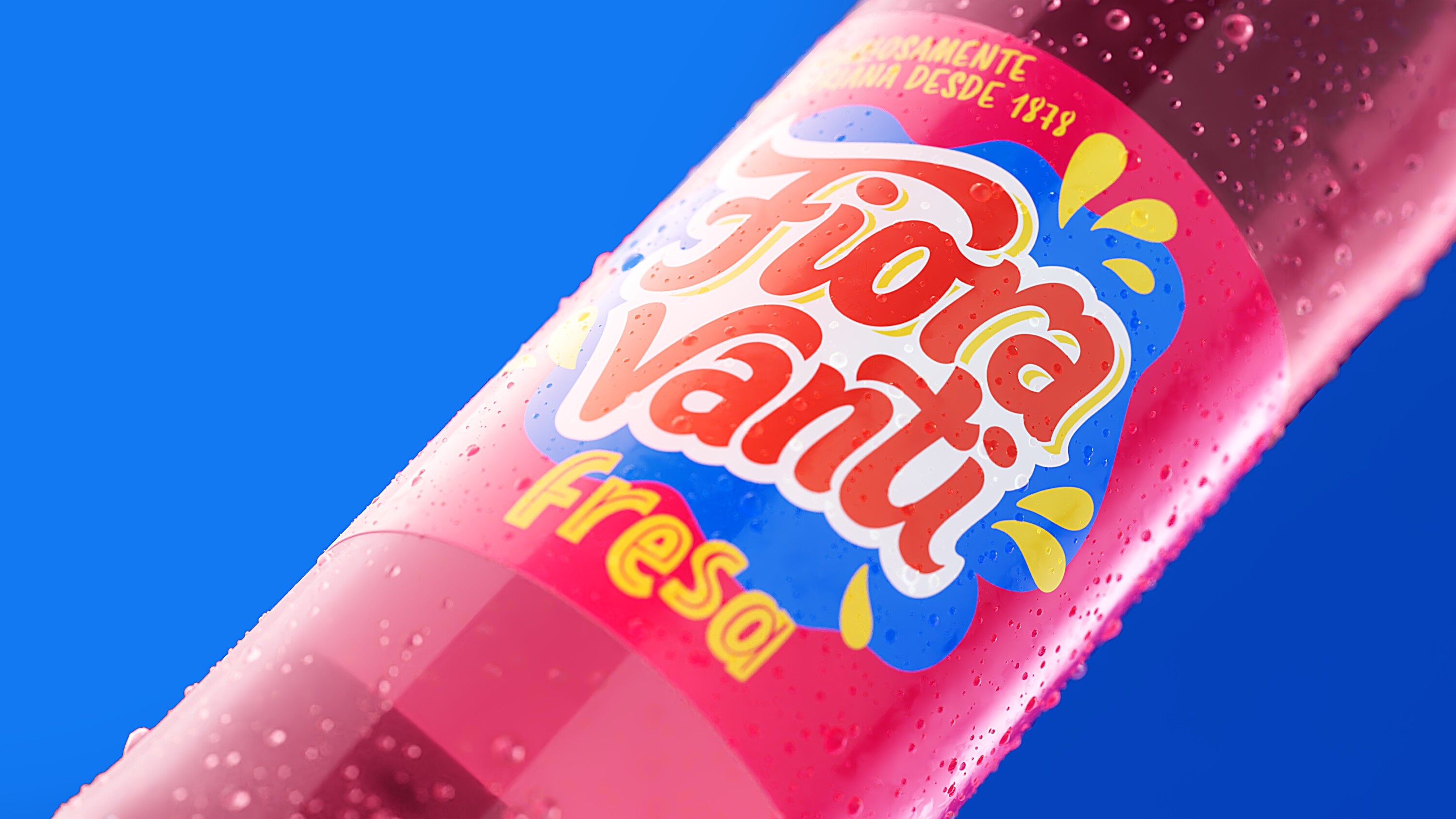
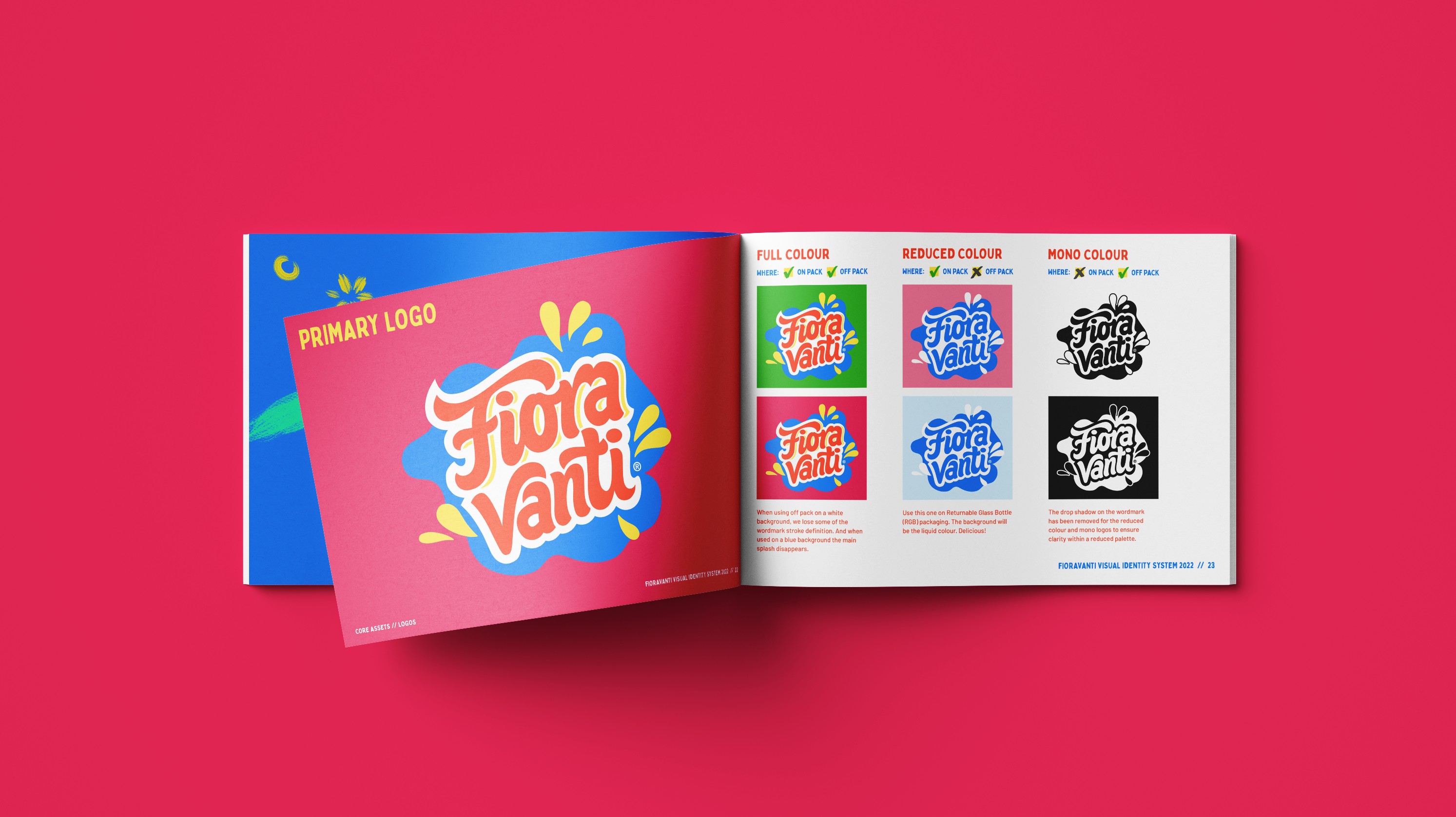
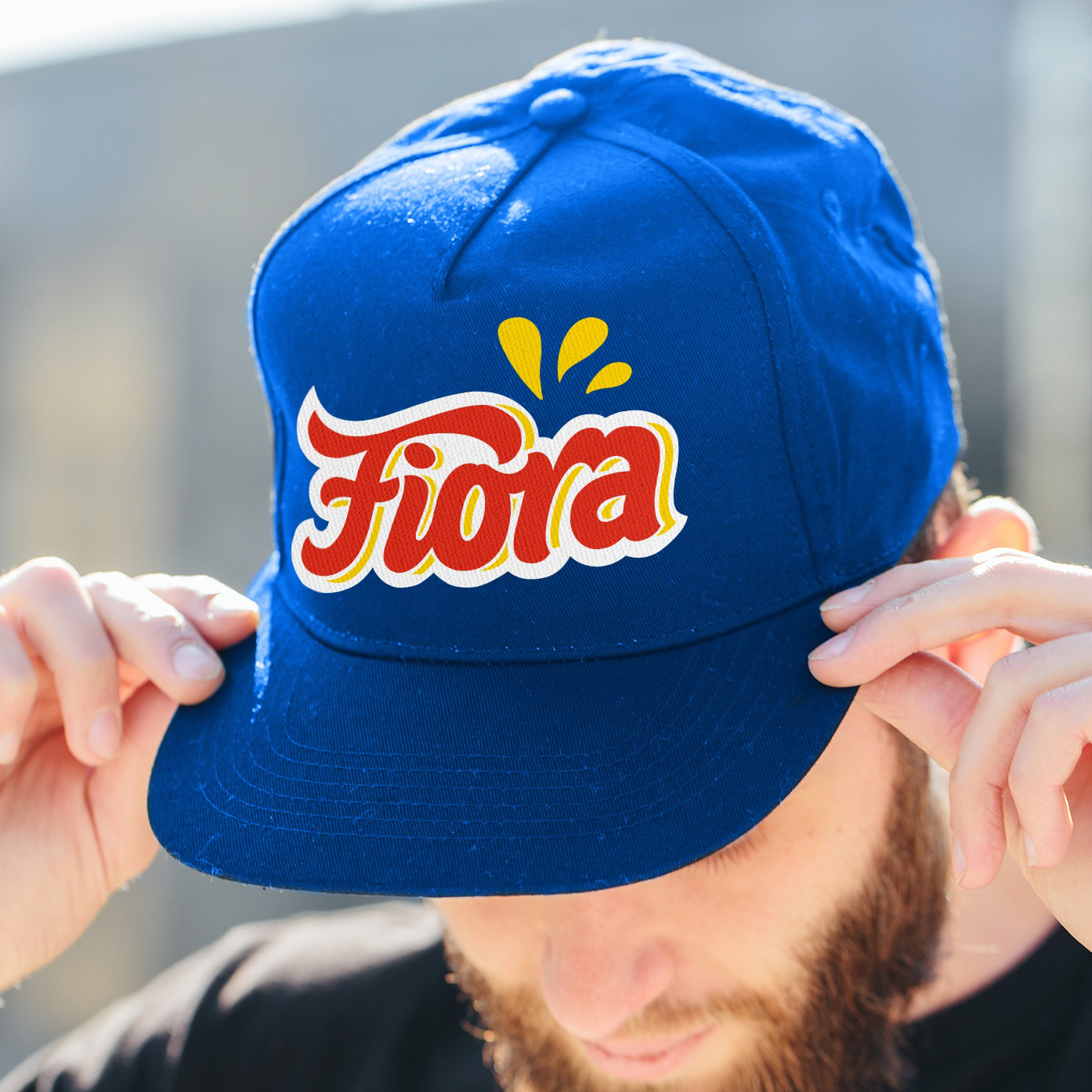
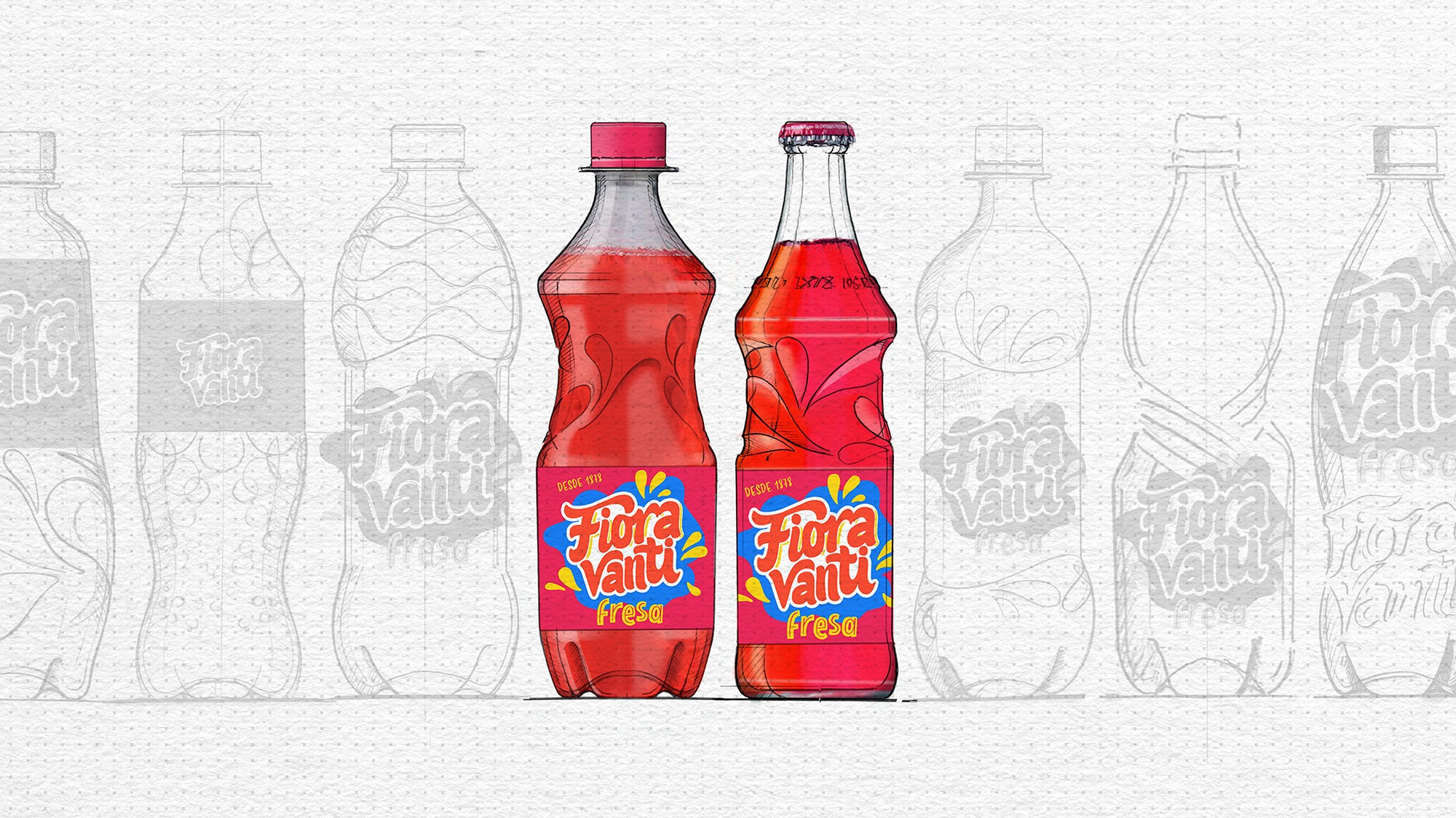
Crafting assets that made a splash.
From our distinctive asset research, there proved to be a lot of love for the brand splash. So we looked to evolve the wordmark to retain its iconicity, while capturing the diversity of the Ecuadorian people with fun, hand-written type styles. With such a distinctive style in mind, we reached out to lettering artist Oli Frape to help us craft our vision. His bold, fluid and freehand approach was the perfect fit to evolve Fioravanti with a delicious new brand mark and a selection of vibrant illustrated assets.
Something to be proud of.
Results
After a decade of decline, Ecuador’s beloved brand is back on a path to growth. In 2024 Fioravanti achieved its highest ever volume growth and surpassed its share of value (SOV) target within the Flavours category.